How We Stand Out
The visual elements that make up our identity allow our audiences to see the authentic Cal Poly and differentiate us from other universities. Using these elements consistently reinforces and strengthens the brand story.

Cal Poly Logo and Marks
A key component of our visual identity, our logo acts as our signature and stamp of quality. Learn more about our logo and marks and access downloadable files including unit and department logo lockups.

Colors
Beyond our logo, color is the most recognizable aspect of our brand identity. See our primary colors (Poly Green and Mustang Gold), as well as our secondary and accent colors.

Typography
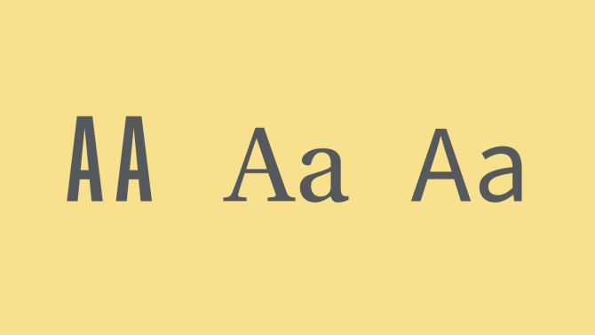
Cal Poly has three official typefaces, chosen to create bold, distinct headlines and easily legible body copy for both digital and print applications. Learn about our typefaces and how best to use them.

Graphics
Our graphics create a unique look and make us immediately recognizable. Used consistently, these elements create continuity among families of materials across campus publications and projects.

Photography
Our photography illustrates Learn by Doing from all angles. Photos should feature engaged individuals and/or dynamic movement, demonstrating that our students will be Ready Day One.

Email Signatures
Email signatures are meant to represent the digital version of your business card and are a reflection of the university. Learn how to create your approved email signature.
