Typography
Our typefaces were chosen to create bold, distinct headlines and easily legible body copy that would translate smoothly between digital and print applications.
Our Typefaces

Abolition
Abolition is a bold, all-caps sans serif font designed to grab your attention. We only use it in the regular weight and only for short display headlines or subheads, since it can be difficult to read at smaller sizes. Never use it for body text. When Abolition is not available, the system font DIN should be used.
FOR PRINT PROJECTS
Minimum size: 16pt., +50 tracking, leading at 20pt. Limit to 10 Words or 55 characters.
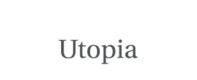
Utopia
Utopia is a serif type font that can be used to convey a formal tone. We suggest it for headlines, subheads and body copy, in regular, semibold and bold weights. When Utopia is not available, the system font Georgia should be used.
FOR PRINT PROJECTS
Suggested body copy size: 9pt., leading at 13pt.

Source Sans Pro
Source Sans is a sans serif type that can be used to convey an informal tone. It was chosen because it can support Chumash characters, like the ones used in the yakʔitʸutʸu housing community.
We suggest it for headlines, subheads and body copy, in light, regular, semibold, bold and black weights. When Source Sans is not available the system font Trebuchet should be used.
FOR PRINT PROJECTS
Suggested body copy size: 9pt., leading at 13pt.
Using Type in Print
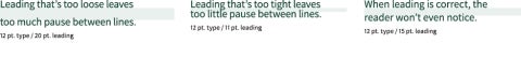
Leading
Leading, also called line spacing, is the vertical distance between lines of text. In most cases, try leading that is 3–4 points higher than the type point size. In general, longer line length means more leading is needed to counteract eye strain.
Tracking
Tracking is unified spacing between groups of letters. Tracking affects the overall character density of the copy and can be used to even out line lengths or make text more legible. In most cases, tracking should be set at the default “0.”
![]()
Line Length
Reading a long line of type causes fatigue as the reader must move their head at the end of each line and search for the beginning of the next line. When line lengths are too short, words or phrases are broken up that are generally read as a unit.

DOWNLOAD OUR TYPEFACES
All of our typefaces are available in Adobe Fonts, through the Adobe Creative Cloud subscription available to faculty and staff. Our Font Activation Guide can help walk you through the process. Instructions and assistance in activating Adobe Fonts are also available via ITS.