The Cal Poly brand has a variety of visual tools that create a unique look and make us immediately recognizable. These elements can be dialed up or down individually to add visual interest and enhance our storytelling. When used consistently, these elements create continuity among families of materials.
Graphic Elements
Some striking graphic elements that help the Cal Poly brand stand out include the Shakespeare type, the shield background graphic, the diagonal graphic and the filled shield.

Shakespeare Type
The Shakespeare type is a custom graphic created from a wood-cut letterpress typeface found in Cal Poly’s Shakespeare Press Museum. It is a nod to our unique heritage and campus. The type should always be anchored to the edges of a composition as shown here.

Shield Background Graphic
The shield background graphic can be created by cropping the mark on the upper right or left hand corner, just below the point where the sunrays meet the arc. Always lower the opacity of the shield background graphic to create a subtle watermark.

Diagonal Graphic
The diagonal line in this graphic creates a dynamic sense of depth in a composition.
Backgrounds
Backgrounds can be dialed up or down individually to add visual interest and enhance our storytelling. When used consistently, these elements create continuity among families of materials.

Architectural Drawings
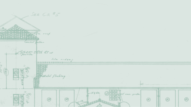
The architectural drawing backgrounds were created from original renderings of campus buildings.

Topographic Map
The topographic map pattern is a vector line-drawing of the Cal Poly campus and surrounding area. It should always be used screened-back as a subtle texture.

Sunburst
The sunburst background was inspired by the sun rays in the Cal Poly shield. It should always be partnered with a low-opacity gradient (90 or 180 degree angle, 20-50% opacity) to create a subtle background texture.
Infographics and Icons

Infographics
We use charts and graphs to display complex data in a digestible and captivating way. Using brand colors and typography, we can create infographics that are consistent with the established brand hierarchy and tone.

Icons
Icons can be used as graphic symbols to draw attention to an important message. Our Font Awesome icons are simple with uniform line weight. Don't use icons for graphic patterns or to create logos.
DOWNLOAD OUR GRAPHICS
All of these graphics are available for you to download and use on your marketing and communication projects.
